Mokachi Font: Testing a Bold Sans Serif for Web Design
I was staring at a Figma file for a new creative coaching brand last Tuesday, and something felt off. The layout was clean, the color palette was warm and inviting, but the headline typography lacked authority. It looked generic. For a brand built on personal empowerment and modern creativity, safe wasn't going to cut it. That is when I decided to test Mokachi, a bold sans serif display font that promised authenticity without sacrificing digital legibility. As web designers, we often toggle between trendy and functional, but finding a typeface that bridges that gap for a live project is where the real work happens.
First Impressions in the Hero Section
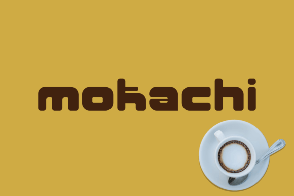
The first place I dropped Mokachi was the main hero section. In web design, this area has about three seconds to communicate value, so the typography needs to do heavy lifting. Mokachi is categorized as a sans serif, but it carries a distinct personality that separates it from standard system fonts like Inter or Roboto. Its geometric structure feels modern, yet there is an organic quality to the letterforms that prevents it from feeling cold or overly corporate.
When applied to a large H1 tag over a textured background image, the font held its own beautifully. The bold weight provides excellent contrast against busy visuals, which is crucial for accessibility and immediate visual impact. Unlike some decorative fonts that crumble when scaled up on high-resolution monitors, Mokachi maintains crisp edges and consistent stroke widths. This stability makes it an ideal candidate for landing pages where the primary goal is to stop the scroll and encourage reading.
Balancing Personality with Readability
A common pitfall with authentic display fonts is sacrificing readability for style. During my testing phase, I specifically checked how Mokachi performed in subheaders and shorter call-to-action phrases. While it shines brightest as a headline font, it remains surprisingly legible at medium sizes. However, I would advise against using it for long-form body copy. For paragraphs, stick to a neutral sans serif or a highly readable serif font to reduce cognitive load. Mokachi works best when it acts as the voice of the brand, guiding users through the hierarchy rather than explaining every detail.
For the coaching website project, I used Mokachi for section dividers and testimonial pull quotes. This created a rhythmic visual experience. Users could scan down the page and instantly recognize key takeaways because the typeface acted as a visual anchor. This strategic use of typography improves user engagement by making content digestible and scannable, which are core tenets of good UX design.
Responsive Behavior and Mobile Optimization
Designing for desktop is only half the battle. When I resized the artboard to mobile dimensions, I had to assess if Mokachi’s bold nature became overwhelming. On smaller screens, heavy display fonts can sometimes feel claustrophobic or aggressive. Fortunately, Mokachi’s open counters and balanced proportions translate well to responsive layouts.
I found that increasing the line-height slightly on mobile helped maintain the font's airy, modern feel. It is also worth noting how the font renders on dark backgrounds. Many bold sans serifs suffer from "bleeding" on dark mode interfaces, where the white pixels glow and thicken the strokes. Mokachi handled this inversion cleanly, retaining its shape without looking blurry. This makes it a reliable choice for SaaS founders or digital product creators who want to offer a seamless dark mode experience without compromising their brand identity.
Strategic Font Pairing for Digital Brands
No font exists in a vacuum. To make Mokachi work effectively in a digital ecosystem, pairing is everything. Because Mokachi has such a strong, confident presence, it demands a supporting actor that knows when to stay quiet. For the boutique online store concept I explored, I paired Mokachi with a clean, humanist sans serif for product descriptions and UI elements like navigation menus and footer links.
- Headlines: Mokachi Bold for impact and brand recognition.
- Subheads: A lighter weight of the body font or Mokachi in a smaller size for hierarchy.
- Body Copy: Neutral sans serif optimized for screen reading.
- UI Elements: Highly legible system fonts for buttons and forms.
This combination creates a sophisticated editorial look that feels premium but remains accessible. If you are designing a portfolio site, you might even consider pairing Mokachi with a classic serif font to create a high-fashion or architectural aesthetic. The contrast between the modern geometry of Mokachi and the traditional elegance of a serif creates a dynamic tension that keeps visitors interested.
Practical Applications Beyond the Homepage
While my primary focus was web layout, Mokachi’s versatility extends across the entire digital brand kit. During the project, I mocked up social media graphics and email newsletter headers using the same typeface. Consistency across these touchpoints builds trust. When a user clicks an Instagram ad and lands on a website that uses identical typography, the transition feels seamless and professional.
For e-commerce projects, Mokachi is particularly effective for promotional banners and sale announcements. Its boldness conveys urgency without resorting to the cliché aesthetics of discount signage. Similarly, for course creators, using this font in module titles and certificate designs adds a layer of perceived value to the educational content. It signals that the material is contemporary and thoughtfully designed, which can subtly influence a potential student's decision to enroll.
Licensing and Technical Considerations
Before committing to any premium font for a commercial web project, always verify the licensing. Mokachi is suitable for branding, logo design, and digital assets, but ensuring you have the correct webfont license is non-negotiable. Check if the download includes WOFF2 formats for optimal site performance. Large font files can slow down Largest Contentful Paint (LCP) scores, so having efficient file formats matters for both SEO and user experience.
Additionally, explore the included alternates and ligatures. Mokachi often comes with stylistic sets that allow you to customize specific characters. Swapping a standard 'A' or 'G' for an alternate version can add a bespoke touch to a logo or a main landing page headline without requiring custom illustration work. These small details elevate a template-based design into something that feels uniquely crafted for the client.
Elevating the User Experience Through Type
Ultimately, choosing Mokachi was about more than just aesthetics; it was about communication. In a digital landscape saturated with sameness, typography is one of the few tools we have to inject genuine character into a user interface. This font succeeds because it respects the rules of modern web design while offering enough distinctiveness to build a memorable brand identity.
Whether you are redesigning a blog, launching a SaaS platform, or refreshing a creative portfolio, Mokachi offers a robust solution for display typography. It encourages bolder layout decisions and helps establish a clear visual hierarchy that guides users naturally through your content. By treating type as a functional component of UX rather than mere decoration, we create digital experiences that are not only beautiful to look at but intuitive to use. Testing Mokachi in a real-world scenario confirmed that it is a valuable asset for any designer looking to bring authenticity and modern polish to their web projects.